
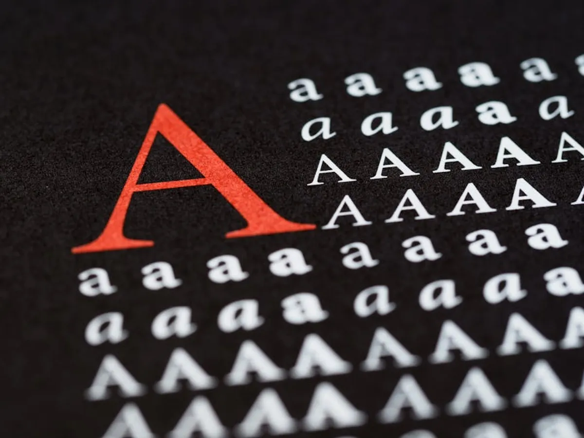
Effective typography extends beyond mere aesthetics; it forms the backbone of visual communication, directly influencing how users perceive, process, and engage with content. For businesses, marketers, and publishers, mastering typography basics translates into improved readability, enhanced brand perception, and ultimately, better conversion rates. This isn't about choosing a "pretty" font, but about strategic application of typographic principles to guide the user's eye, convey information efficiently, and build a consistent brand voice across all digital touchpoints. Overlooking these fundamentals can lead to fractured user experiences, reduced comprehension, and a diminished professional appearance, directly impacting commercial objectives.
Key Typographic Elements
Typeface Selection
Choosing the right typeface sets the foundational tone for any visual design. Typefaces fall into broad categories, each carrying distinct connotations. Serif typefaces, characterized by small decorative strokes (serifs) at the end of character strokes, often convey tradition, authority, and readability in long-form text, making them suitable for editorial content or formal branding. Sans-serif typefaces, lacking these strokes, project modernity, simplicity, and clarity, performing well for digital interfaces, headlines, and corporate communications. Display typefaces are designed for impact at large sizes, typically in headlines or logos, and are less suited for body text due to their often elaborate forms. Script typefaces emulate handwriting, offering elegance or a personal touch but demanding careful application to maintain legibility. The decision should align with brand personality, target audience expectations, and the primary function of the text.
Font Size and Hierarchy
Font size establishes a visual hierarchy that guides users through content, indicating relative importance and relationships between elements. A well-defined typographic scale ensures consistent and harmonious sizing across headlines (H1-H6), body text, captions, and supplementary information. Larger sizes command immediate attention, signaling primary content or calls to action, while smaller sizes are reserved for less critical details. This hierarchy improves scannability, allowing users to quickly grasp the structure of a page and locate relevant information without exhaustive reading. Implementing a consistent size system, often based on a modular scale (e.g., 1.25x or 1.5x increments), maintains visual balance and predictability, enhancing the overall user experience.
Line Height (Leading) and Line Length
Line height, or leading, refers to the vertical space between lines of text. Optimal line height is crucial for readability; insufficient spacing causes lines to merge visually, making text dense and difficult to track, while excessive spacing fragments paragraphs. A general guideline for body text is a line height of 1.4 to 1.6 times the font size. Line length, the number of characters per line, also impacts reading comfort. Lines that are too short force the eye to jump frequently, disrupting rhythm, while lines that are too long make it challenging to locate the beginning of the next line. An ideal line length for body text ranges from 45 to 75 characters per line, including spaces, ensuring a comfortable reading pace and reducing eye strain.
Letter Spacing (Tracking) and Word Spacing
Letter spacing (tracking) adjusts the uniform space between all characters in a block of text, while word spacing controls the space between words. These micro-adjustments fine-tune the visual density and legibility of text. Tighter tracking can make headlines appear more cohesive, but too tight for body text reduces readability. Looser tracking can improve legibility for some display fonts or very small text, but can also make text appear airy or disconnected. Proper word spacing prevents "rivers" of white space from flowing through paragraphs, which can distract the reader. Manual kerning, which adjusts the space between specific pairs of characters, is typically reserved for display type, logos, or critical headlines to achieve precise visual balance.
Principles of Visual Harmony
Contrast and Readability
Effective contrast is fundamental for readability and accessibility. This extends beyond color contrast (text color against background color) to include visual contrast created by variations in font size, weight (boldness), style (italic), and typeface. High color contrast ensures text is discernible for all users, including those with visual impairments, and is a key accessibility standard (WCAG guidelines often recommend a contrast ratio of at least 4.5:1 for normal text). Visual contrast helps differentiate headings from body text, emphasize keywords, and break up long blocks of content, making information more digestible and engaging. Poor contrast leads to frustration and abandonment, directly undermining content effectiveness.
Consistency and Brand Identity
Consistent application of typographic choices is vital for building a strong brand identity and ensuring a cohesive user experience. A defined typographic system, specifying primary and secondary typefaces, their sizes, weights, and usage rules, creates a predictable visual language. This consistency reinforces brand recognition across all platforms, from websites and applications to marketing materials. Deviations from established typographic guidelines can make a brand appear unpolished, unprofessional, or disjointed, eroding trust and diluting its unique visual voice. A well-maintained style guide serves as the essential reference for maintaining this consistency.
Responsive Typography
With diverse device usage, responsive typography is no longer optional; it is a necessity. This principle involves adapting typographic elements to different screen sizes and orientations to maintain optimal readability and design integrity. Responsive strategies include fluid font sizes that scale with the viewport, adjusting line heights and line lengths for smaller screens, and sometimes even changing typefaces or weights for mobile to prioritize legibility. Neglecting responsive typography results in cramped text, awkward line breaks, or excessively large headlines on mobile devices, leading to a poor user experience and increased bounce rates for a significant portion of the audience.
Practical Application and Tools
Implementing effective typography requires a systematic approach and iterative refinement. Start by defining a clear typographic scale and a limited palette of typefaces (typically one to two families) that align with your brand and content goals. Develop a comprehensive style guide that documents all typographic rules, including usage for headings, body text, links, buttons, and captions across various contexts. This guide ensures consistency across design and development teams.
Pro Tip: Avoid using more than two distinct typefaces in a single design for general content. Exceeding this limit often introduces visual clutter, makes the design appear amateurish, and actively hinders readability by forcing the reader's eye to adjust to too many different visual styles. Reserve a third, more decorative typeface strictly for impactful headlines or specific branding elements, and use it sparingly.
User testing is invaluable for validating typographic choices. Observe how real users interact with your content on different devices. Are they struggling to read? Are they finding key information easily? Pay attention to metrics like time on page and bounce rate, which can indirectly signal readability issues. Utilize browser developer tools to inspect and adjust typographic properties in real-time. Accessibility checkers can also help identify potential contrast issues that might impede readability for some users.
- Prioritize legibility over novelty: A unique font is only effective if it remains easy to read.
- Test on multiple devices: Ensure your typography adapts gracefully to various screen sizes.
- Use a consistent typographic scale: Establish clear sizing relationships for all text elements.
- Check contrast ratios: Ensure sufficient contrast between text and background for accessibility.
- Consider content context: Adapt typography based on the message and audience.
Refining Your Visual Language
The strategic application of typography is a continuous process of refinement, not a one-time setup. Regularly audit your digital properties to assess the effectiveness of your current typographic choices against user engagement metrics and accessibility standards. Pay attention to feedback regarding readability and visual comfort. As design trends evolve and user expectations shift, be prepared to iterate on your typographic system, always prioritizing clear communication and an intuitive user experience. A well-honed visual language, built on solid typographic principles, directly contributes to stronger brand recognition, higher content consumption, and ultimately, more successful commercial outcomes.
Frequently Asked Questions
How many fonts should I use in a design?
Generally, limit yourself to one or two primary typefaces. Using more than two can create visual chaos and dilute your brand's identity. A single typeface with multiple weights and styles (e.g., light, regular, bold, italic) can often provide sufficient variety and maintain cohesion.
What is the difference between a typeface and a font?
A typeface is the design of the letters (e.g., Helvetica, Times New Roman). A font is a specific instance of that typeface, including its weight, style, and size (e.g., Helvetica Bold 12pt). In common usage, the terms are often used interchangeably, but the distinction is important in professional design contexts.
How does typography affect SEO?
While typography isn't a direct SEO ranking factor, it significantly impacts user experience (UX). Good typography improves readability, reduces eye strain, and makes content more engaging, leading to lower bounce rates and longer time on page. These positive UX signals can indirectly contribute to better search engine rankings as search engines prioritize content that satisfies users.
What are common typography mistakes to avoid?
Common mistakes include poor contrast between text and background, using too many typefaces, incorrect line height or line length that hinders readability, neglecting responsive adjustments for mobile devices, and using all caps for long blocks of text. Prioritizing legibility and consistency helps avoid these pitfalls.